observability: remove line color dividing warning/critical thresholds
Created by: slimsag
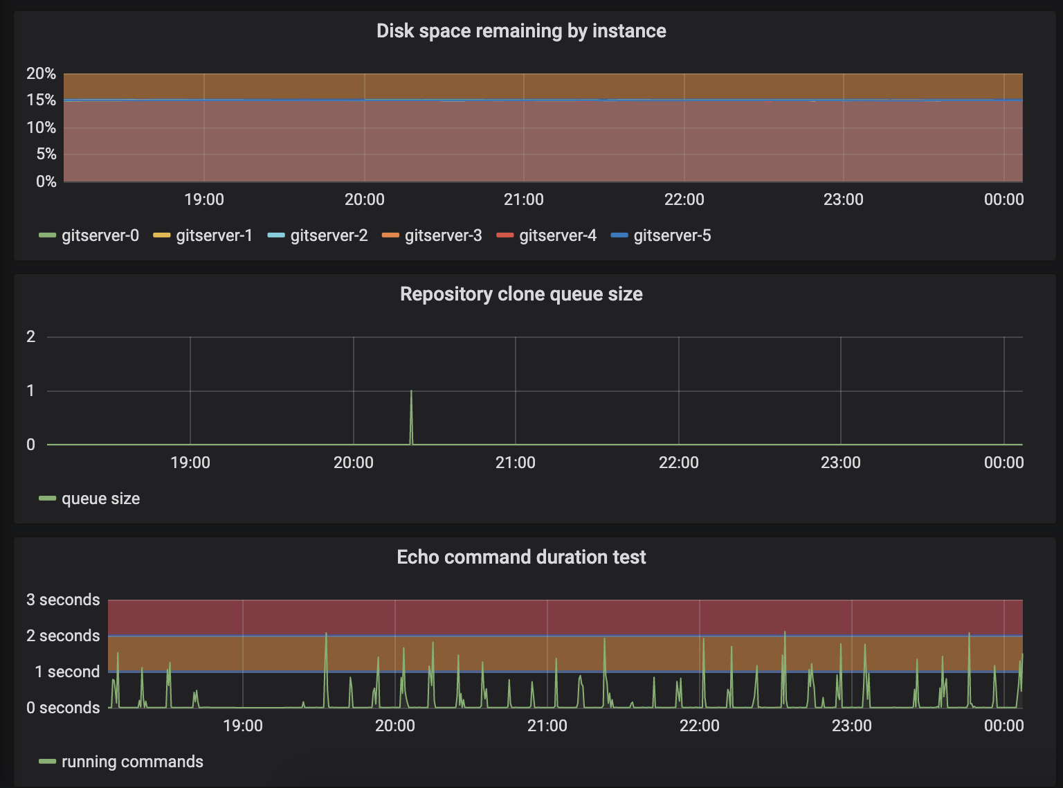
Consider the following screenshot and answer "what is the remaining disk space?" -- is it 15%, or is that just the divider between the "warning" and "critical" threshold colors?:
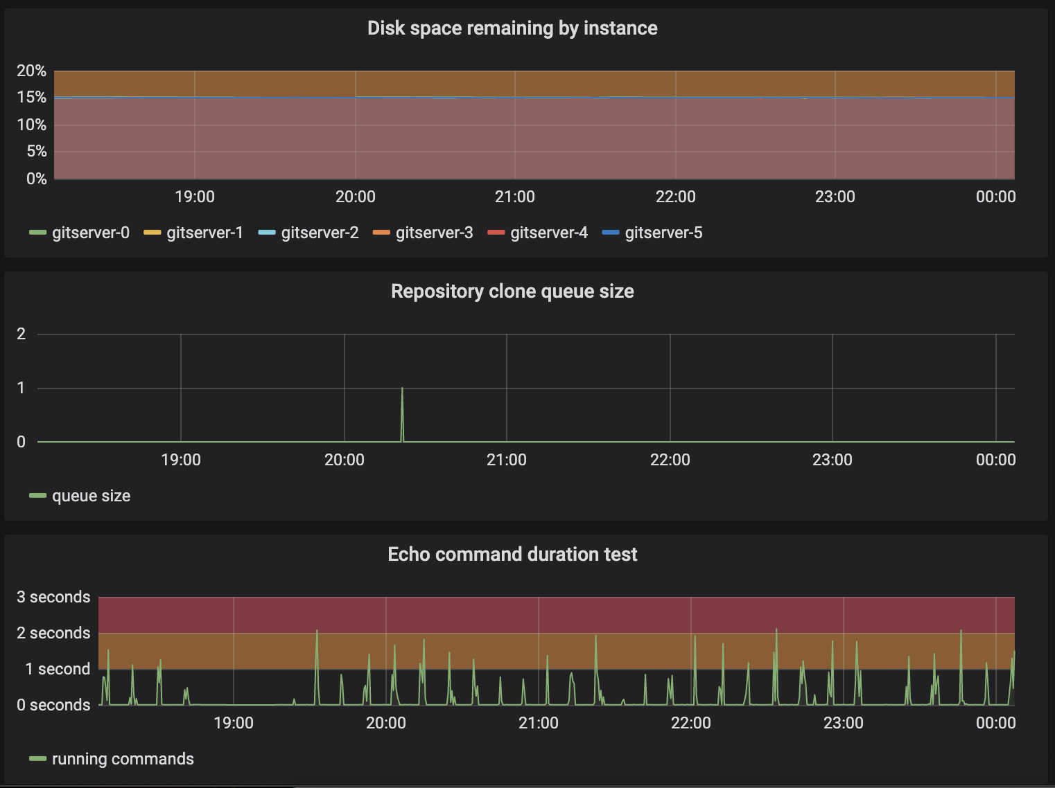
If we remove the line dividing the colors, it becomes at least a bit more apparent (and you don't have to second-guess yourself):
Fixes #9830

