notebooks: Refactor column layout
Created by: fkling
While working on the notepad CTA (which will be a separate PR), I noticed some minor issues with current layout of the notebook page. In particular:
- Gap/outline overflow appearing with small window height (at least in Firefox)
- Seemingly erratic scroll behavior when scrolling the outline (at least in Firefox)
- Incorrect position of tooltip text for very long headings
- Header and action alignment on small screens.
Instead of using flex box with three columns and making one column sticky (which I assume was done to (1) center the content within the window and (2) have the scrollbar for the main content appear on the right edge of the window), the new approach uses two columns which allows it to make them scrollable independently.
I tried to preserve the current look and feel as much as possible. In particular:
- Fixed outline heading and scrollable headings list
- Scrollbar for main content is positioned at the right edge of the window
Screenshots/Videos
Outline gap/overflow: See lower right side. This is fixed with the new approach. This might not be something a user will run into during normal operation, but to me it's an indication that something doesn't work quite right.
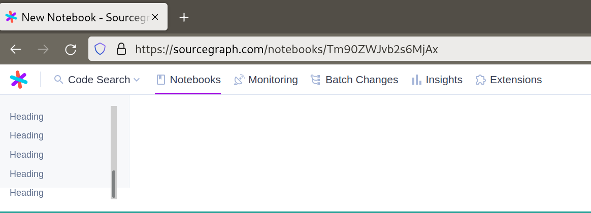
Tooltip position (top: new, bottom: old):
https://user-images.githubusercontent.com/179026/164456288-d7f65e02-3a5a-4e7f-a937-7231a4f8677c.mp4
Erratic scroll behavior: Since we have two nested scroll containers (left sidebar and parent element of the three columns), it looks like reaching the end/beginning of the sidebar sometimes(?) causes the parent element to scroll. But since we sync main content position with outline position that in turn causes the sidebar to scroll too. This doesn't happen with the new approach because the scroll containers are not nested.
https://user-images.githubusercontent.com/179026/164456327-dca4f2f4-d0c1-4fd9-94f1-6f733a3697b3.mp4
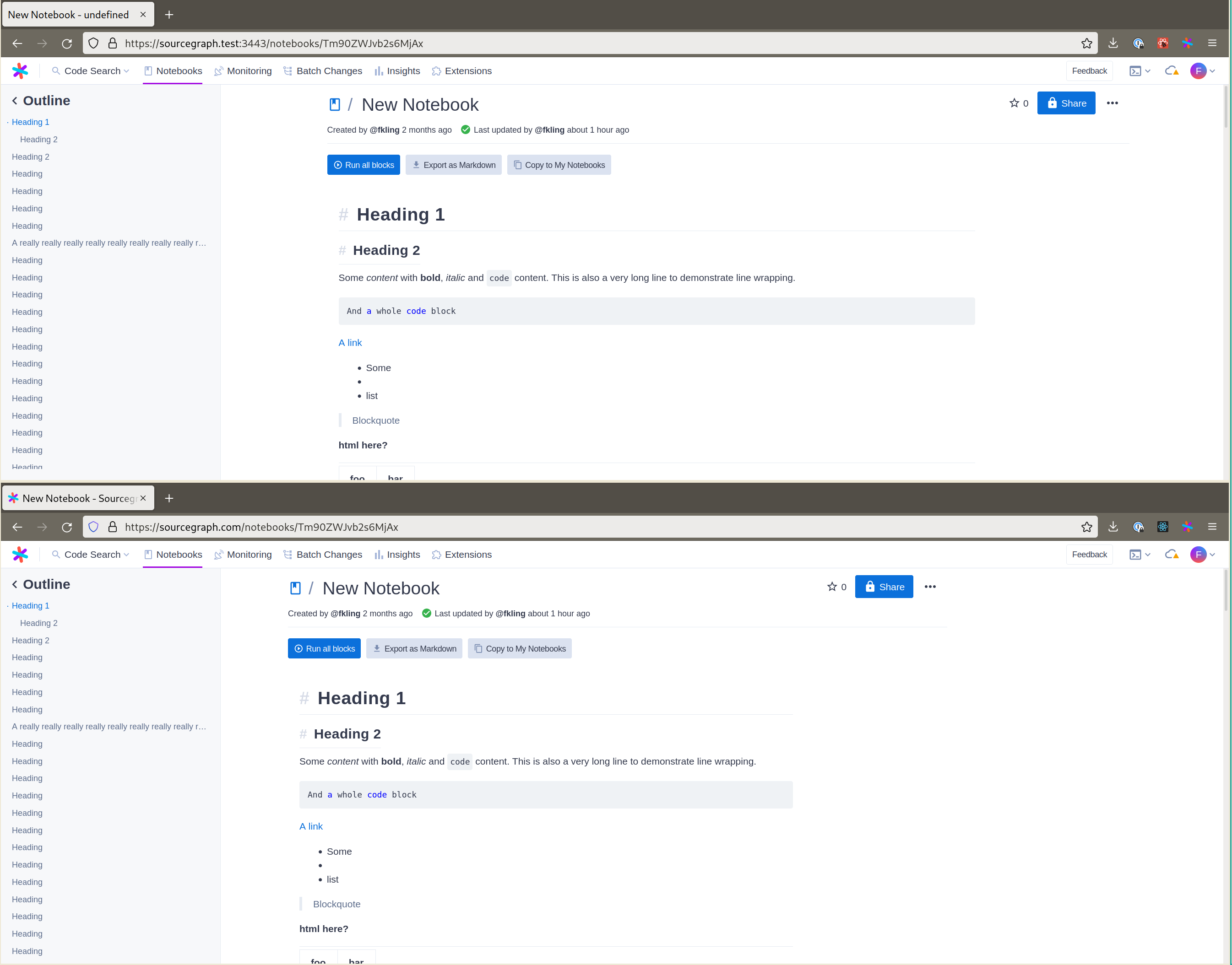
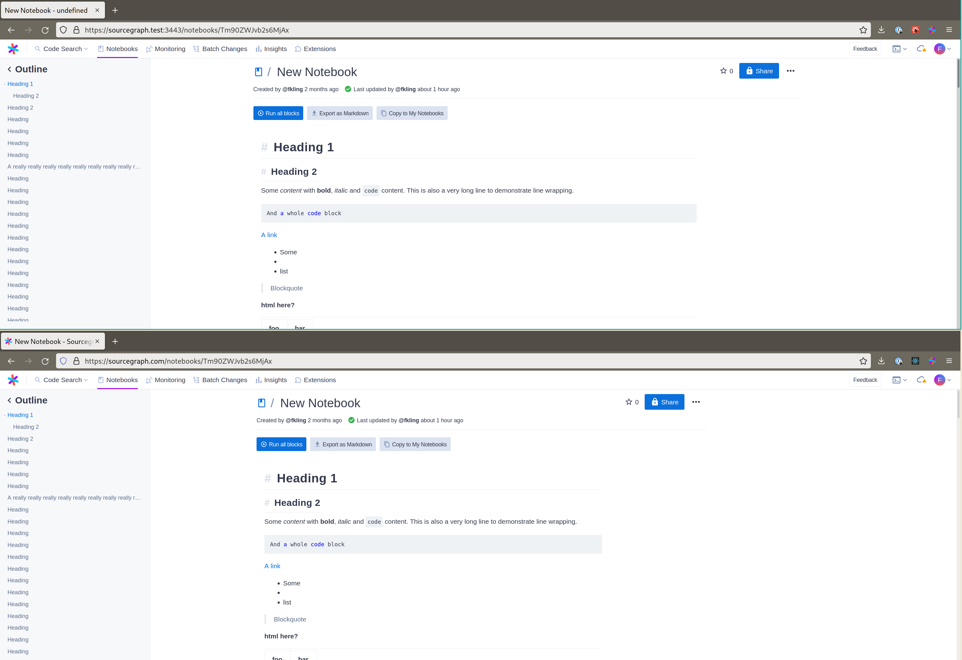
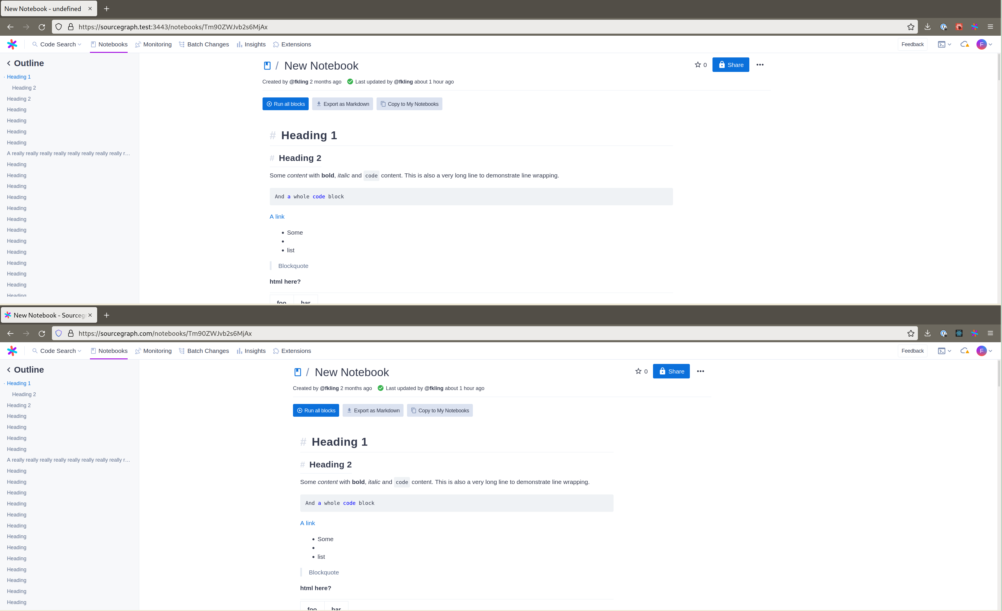
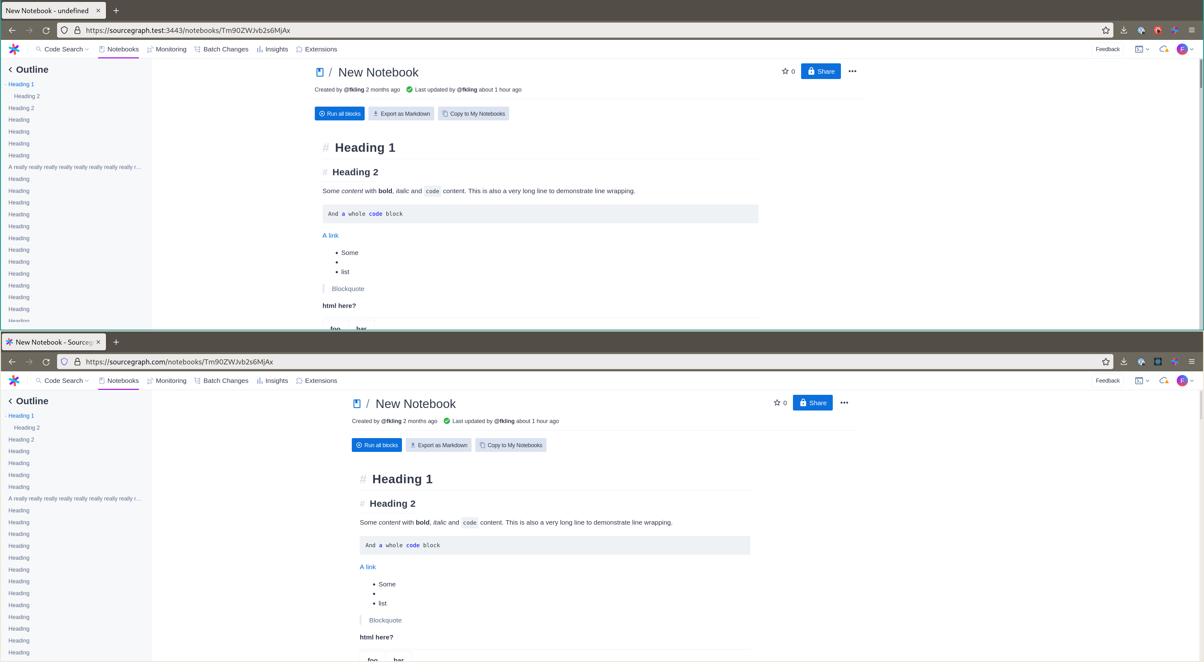
Comparing old (bottom) and new (top) pages at different screen sizes: Since the new layout only uses two column, the main content isn't perfectly centered within the whole window anymore, but I hope that's OK (and less important compared to the fixes).
So the main difference is the width of the main content (we reach max-width "sooner") and the gaps between the outline and the main content and the right edge and the main content.
This one also shows the alignment change of the star button by removing the left padding:

No difference when the outline is hidden:

Without an (empty) right column, the outline takes up more space, but that actually looks better to me (entirely subjective of course). There is no empty space on the right hand side:
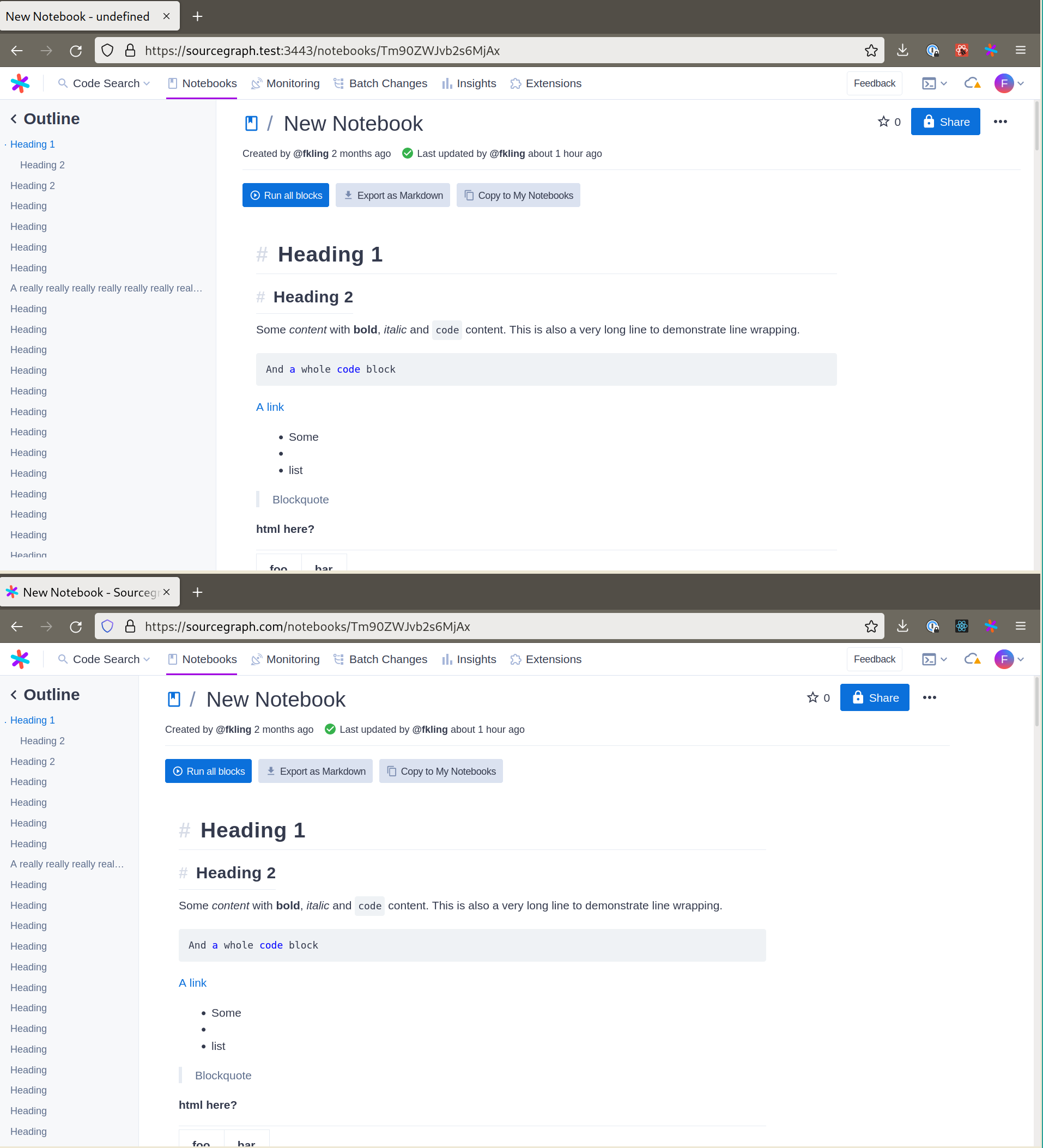
Similar here though the way things are currently structured, space will first be added between the outline and the main content instead of the main content and the right hand side, which seems a bit odd to me. I think this could be changed (if desired).
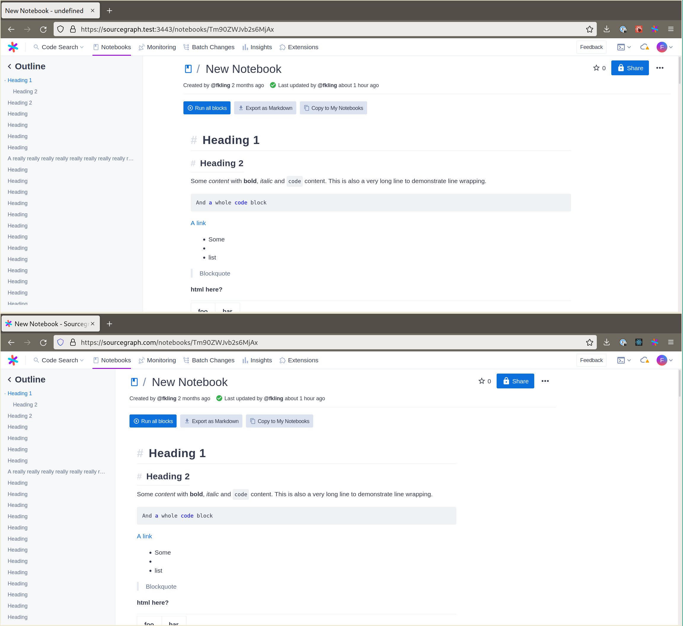
The remaining screenshots just show how gaps/spaces and content size differ between old and new at various sizes.
Test plan
Manual testing. Opened a Notebook and created a lot of headings. Resized the window to observe how the outline and main content are positioned. Scrolled outline and main content.
App preview:
Check out the client app preview documentation to learn more.