Overhaul tooltip close button & badge styles
Created by: felixfbecker
This is a major overhaul of the close button and badge styles of hover overlays to solve a long-standing problem.
For some history, the close button has always been positioned absolute. This meant it used to overlap the content if it was long, which some users complained about. As a workaround, the close button was changed to only show on hover, but that lead to other problems. As it is right now there is no way to see if the tooltip is pinned or not without hovering it (#4938 (closed)), and it's impossible to close it on touch devices (#3024). Additionally, with the addition of badges, there was JS logic to "offset" the badge if it is in the same place as the close button, something that really should be handled with CSS. The badges, that are not just shown on hover, can also overlay the content (#10459 (closed)).
The ideal solution here is to have the close button always be shown, but not overlay the content. This PR achieves that.
The proper way to have an element float and have text flow around it in CSS is not some cool modern flexbox approach but good old float. The only requirement for this is that the text content is one continuous flow and has no element that create a new block formatting context (or the the block would be next to the button, but not flow around the button). Instead of borders for each item we separate items by <hr> (which we already use in extensions anyway).
To handle the edge case where there is a lot of hover content and it scrolls, we keep the close button in its position with position: sticky. This means the button can still overlap in this edge case, but that is okay because the content under it can be "moved away" by scrolling, and having the text reflow would be jarring. It will never overlap in the initial scroll position.
This also implements the "proper" solution I had hinted at in https://github.com/sourcegraph/sourcegraph/pull/10517#discussion_r428061771 to make icon classes configurable for the browser extension: There is buttonIconClassName (previously closeButtonClassName) for buttons that contain only an icon and should have no border etc, and iconClassName for any icon to give it the right sizing and alignment. I did a pass over each code host to make sure they look good. With these configurations, BadgeDecorationAttachment needs no custom styling anymore.
Another small change: We now inform the user when there is no hover content, instead of showing only the buttons. Primarily because the close button would otherwise be weirdly in a white box or overlay the find references button. A future improvement could be showing the hovered token instead.
Also fixes the code style in Gitlab (#3194 (closed)).
Testing
I added stories for the important scenarios, which you can find in Percy. This should prevent any regressions on this. Because they include the BadgeDecorations, I deleted the story for that (we pay $$$ for each snapshot after all...). I also replaced the styling-selector-dependent unit tests with snapshot tests because they were failing after changing the styling, and we shouldn't ever have to update unit tests manually after changing CSS styling. Similarly I deleted part of the HoverOverlay tests that were failing and openly admitted to relying on internals. The things they tested are tested in many different ways now (storybook and unit tests for renderMarkdown()).
I also added a story to see/test how the HoverOverlay looks with non-webapp styling using Bitbucket styling (Bitbucket because they publish their CSS as a package on NPM). Modified storybook config to make this work.
Screenshots
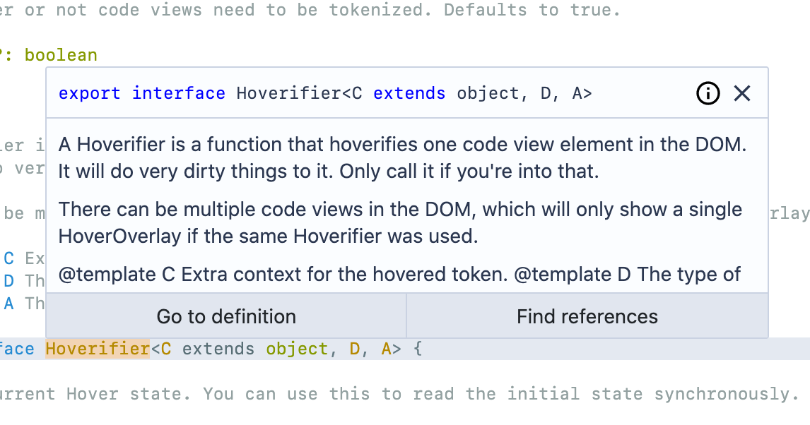
Sourcegraph

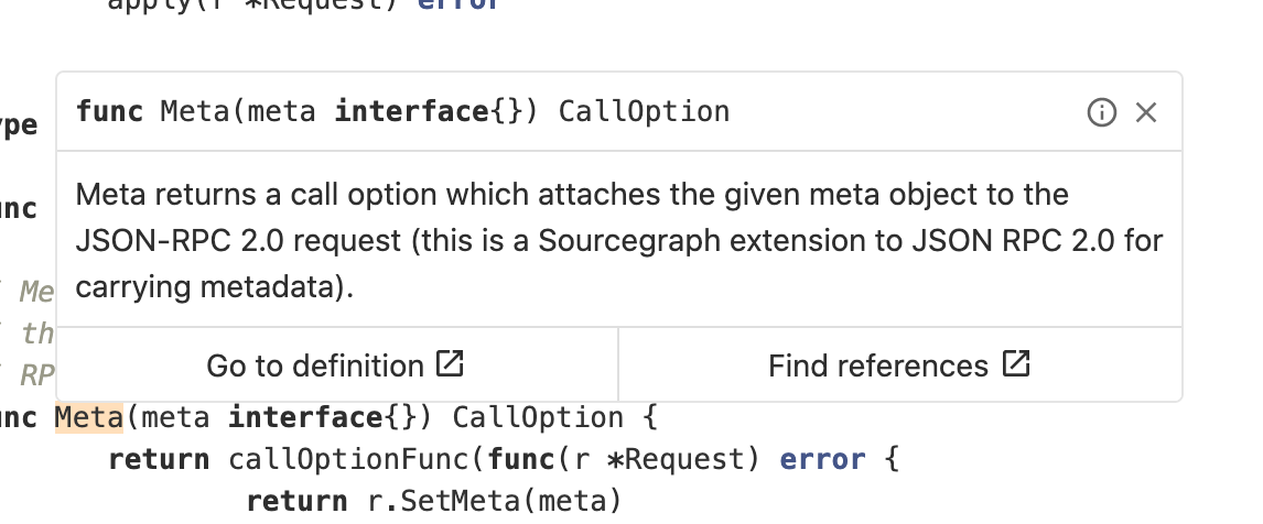
Gitlab

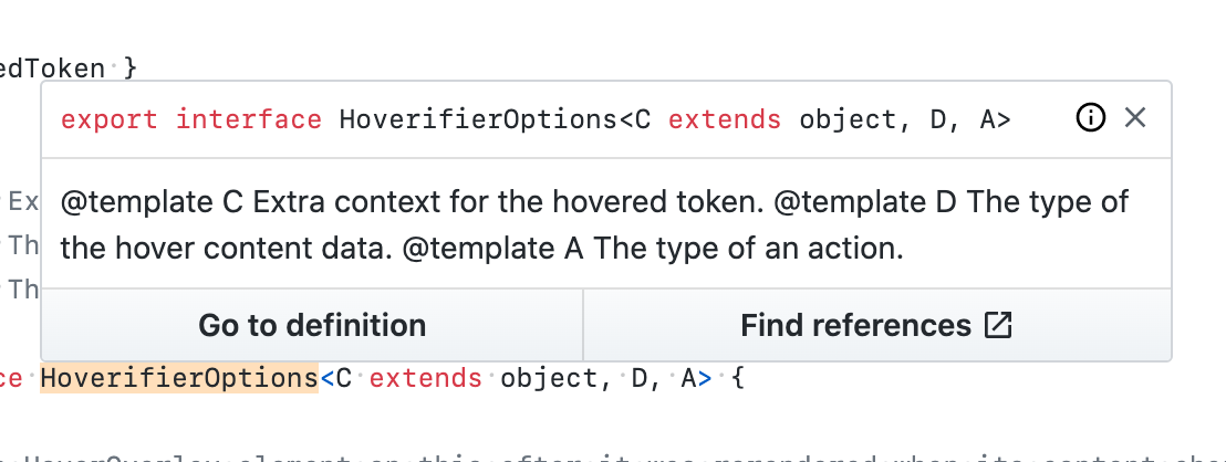
GitHub

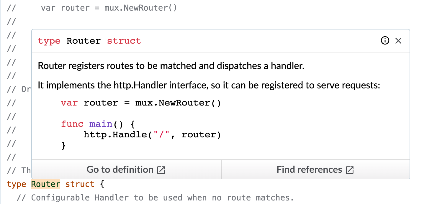
Phabricator

Bitbucket see Percy
Fixes #4938 (closed) Fixes #3194 (closed) Fixes #10459 (closed)