List styling is not consistent across features
Created by: imtommyroberts
I've noticed some inconsistency in the way borders are styled in lists. I'm drawing attention to it, as I think it would be an easy fix that would increase a sense of cohesion.
I think all lists should follow the border styling we see in lists in 'Repositories', 'Users & auth' etc (Site admin)
Examples (inside red outlines):
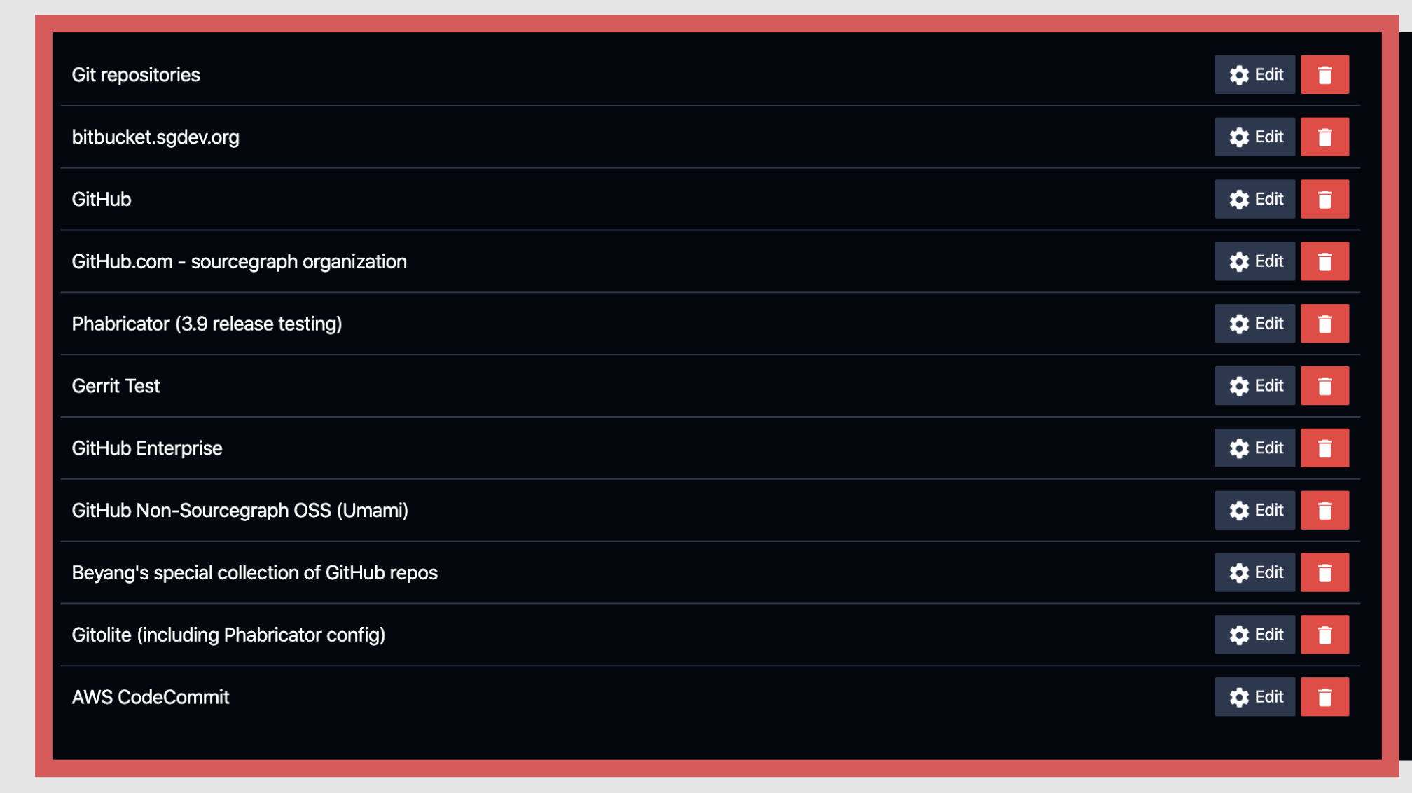
Manage repositores:
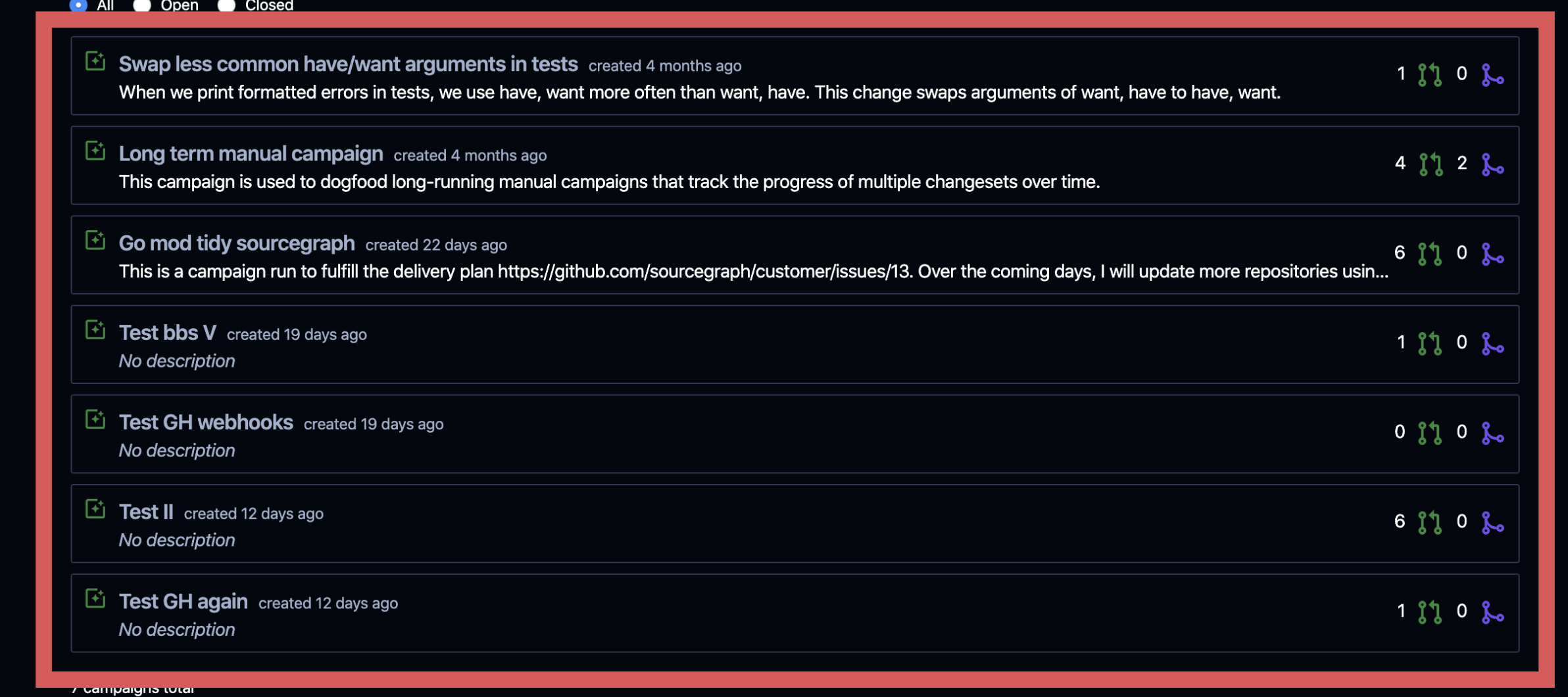
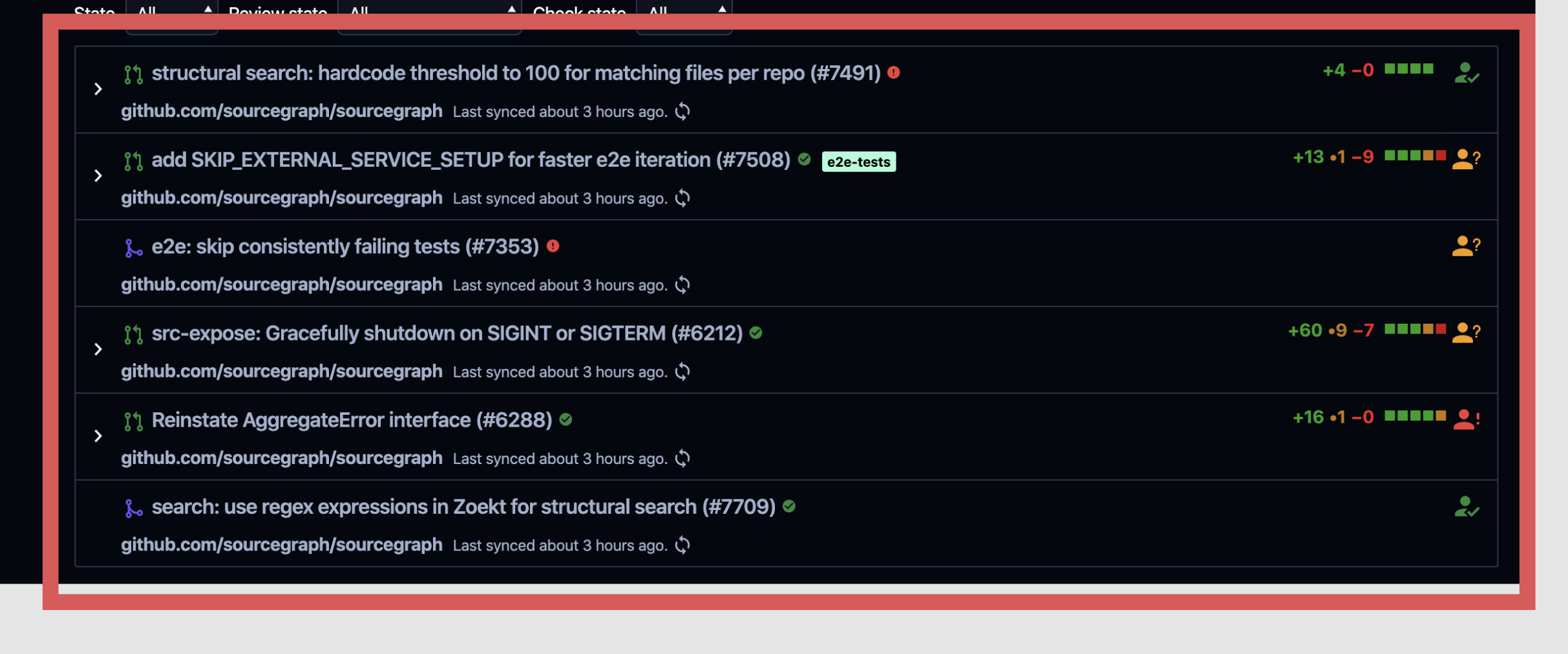
Campaigns (these two are also different to each other):
My proposal is that 1 and 2 (and elsewhere in campaigns and sourcegraph as a whole) should follow the list border styling in 'Manage repositories'.
Interested in hearing cases for other border styles, or reasons why it might actually be better to have separate styling in certain features.


