Make it clearer how to go from list of changesets to changeset on codehost
Created by: mrnugget
This ticket is an extraction from https://github.com/sourcegraph/sourcegraph/pull/8020:
@mrnugget:
@unknwon reported to me that he didn't immediately recognize how to go from the changeset entry to the pull request on GitHub, which made me think that we should add an ExternalLinkIcon next to the title (along with adjusting colors etc.). With such an icon: does the title line get too busy?
@felixfbecker:
I think this is a larger question, because this is just the standard link color we use everywhere in the app. If that is not obvious to be clickable, it would mean we would have to revamp it everywhere, because it wouldn't make sense to add icons as a workaround in some places if the link color is generally not obviously clickable. Interestingly though, GitHub's PR titles are actually black (and only the title is clickable). I'd be curious to hear if you feel the same way about those @unknwon, or whether they it's that they give an additional hint that we could add too (hover background shade? Blue hover color?).
TL;DR I think we should discuss that separately but happy to have that discussion. Moving the checks somewhere else if we take such action would not be hard.
@mrnugget:
I don't think we need to "revamp it everywhere" to make this particular external link stand out a little more
🙂 Context always plays a role and just because something doesn't work in one context doesn't mean it it won't work in another one.In this case here, for example, the link right next to it, the repository name, is a light grey:

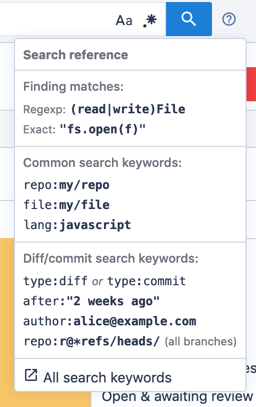
That doesn't help distinguishing links from non-links, but it makes sense for them to be different, I guess, because the link to the changeset on the codehost is an external link and those sometimes have this icon next to them (see "All keywords..." at the bottom):

(Note: that link is also not blue)
TL;DR I think we should discuss that separately but happy to have that discussion. Moving the checks somewhere else if we take such action would not be hard.
Yep, agree, as I said, I probably should open a separate issue for this.
@unknown:
I think I wasn't crystal clear when I gave the feedback to @mrnugget yesterday, the problem/confusion I encountered was:
- I know the title looks like a clickable link
- I also see same GitHub PR icon (was thinking, might be clickable?)
- And the GitHub repository URL (feels like a clickable thing with first intuition)
Thus I start wondering which one is the "correct" think to click could lead me to the GitHub PR page. For me, I don't think it's about colors, it's that there is no clear indication which one would lead me to the code host.
One easy solution to me is to do the same thing as we do in the file view: image
A GitHub Logo is a clear indication it would take me somewhere related to GitHub, and a hover tip explains in detail, could just say "See pull request on GitHub/Bitbucket Server", etc.

