a8n: Small possible UI improvements
Created by: mrnugget
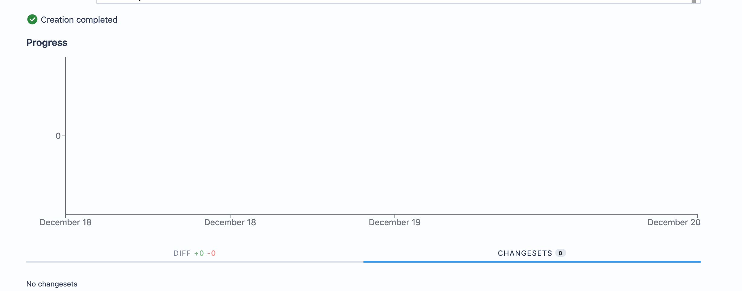
Empty burndown chart

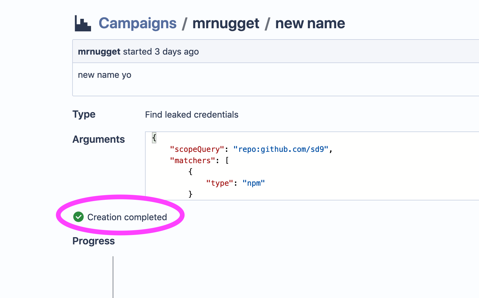
"Creation complete" is sticky
Why does this stick around even if I view a newly created Campaign days later?

No changesets
Why display the tabs if there are no changesets? I think it would look cleaner if there were not tabs and instead just a "no changesets" and if it's a manual campaign a button "add changesets"

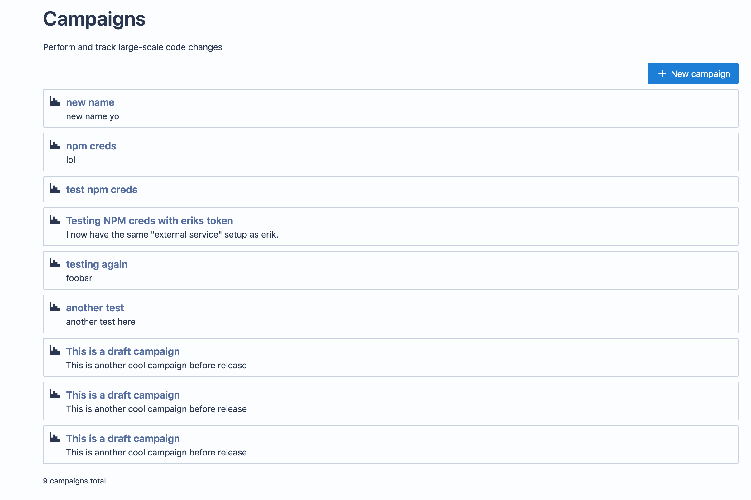
Campaign Index view
What I want to see here:
- Type of Campaign
- Number of changesets in it
- CreatedAt
- ...

Progress Bar
I think it would be great to have proper progress bar, instead of just a counter.