[Accessibility]: Ref panel is difficult to use on mobile
Created by: varungandhi-src
Audit type
Mobile device navigation
User journey audit issue
https://github.com/sourcegraph/sourcegraph/issues/33510
Problem description
I'm making this as one issue for now since these factors seem related.
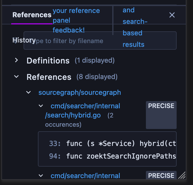
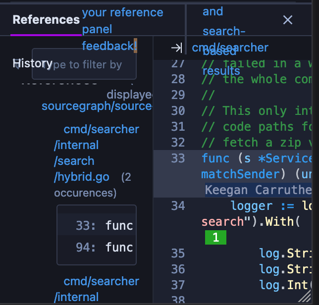
- There is a high degree of visual overlap between different elements, with different elements being clipped, flowing across multiple lines and so on. It seems like there is a more fundamental issue here, not just misuse of components or something, because the current design relies on using horizontal space for long paths and the file preview on the side, but horizontal space on mobile is very limited.
- The Close code view button cannot be clicked; if I double-click on it, the "your reference panel feedback!" line gets selected.
- Navigating and tapping in the code preview on the side is very cumbersome because of limited horizontal space.
Expected behavior
- Different elements shouldn't visually overlap or be clipped.
- There should be more space available to the file preview.
- All buttons should be clickable.
Additional details
Assigning labels
-
Please give this issue an estimate by applying a label like estimate/Xd, where X is the estimated number of days it will take to complete. -
If this issue is specific to a specific Sourcegraph product, please assign the appropriate team label to this issue. -
If this issue will require input from designers in order to complete, please assign the label needs-design. -
If you are confident that this issue should be fixed by GitStart, please assign the label gitstart.
Owner
This issue will be fixed by my team, I have assigned a relevant member to it, or I will do so in the near future.