Wildcard button: text in disabled buttons is too bright in dark mode
Created by: limitedmage
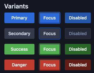
In dark mode, the text color in disabled buttons, especially of the primary variant, but to some extent also in the success and danger variants, is too bright. It's not visually clear, in isolation, if the button is disabled or not. Using gray text would make it clearer that the button is disabled.