[Accessibility]: Disabled button text on light theme does not have good contrast ratio
Created by: kopancek
Audit type
ARC Toolkit
User journey audit issue
https://github.com/sourcegraph/sourcegraph/issues/34111
Problem description
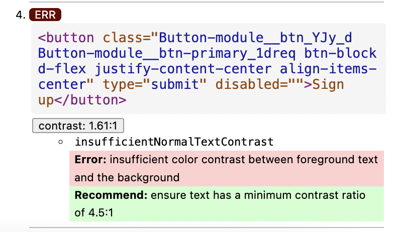
When a button is in disabled state, the text of the button does not have good contrast ratio, as indicated by ARC Toolkit. We should use a different text color or background color for disabled buttons to rectify this.
Expected behavior
Disabled button contrast ratio should be above the minimum level set in the ARC Toolkit
Additional details
Assigning labels
-
Please give this issue an estimate by applying a label like estimate/Xd, where X is the estimated number of days it will take to complete. -
If this issue is specific to a specific Sourcegraph product, please assign the appropriate team label to this issue. -
If this issue will require input from designers in order to complete, please assign the label needs-design. -
If you are confident that this issue should be fixed by GitStart, please assign the label gitstart.
Owner
I'm unsure who should work on this issue or if it needs more clarification. I will let the Frontend Platform team triage this.