Code Insights: Fix funky colors of insight data series
Created by: vovakulikov
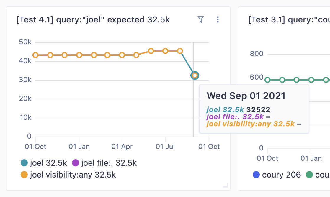
In some cases when we have a few data series with differences in x points value we have this weird strange visual effect. I assume that we need to filter our gaps in the chart in the data series have it but we also should preserve non-existing points at the beginning of the chart.