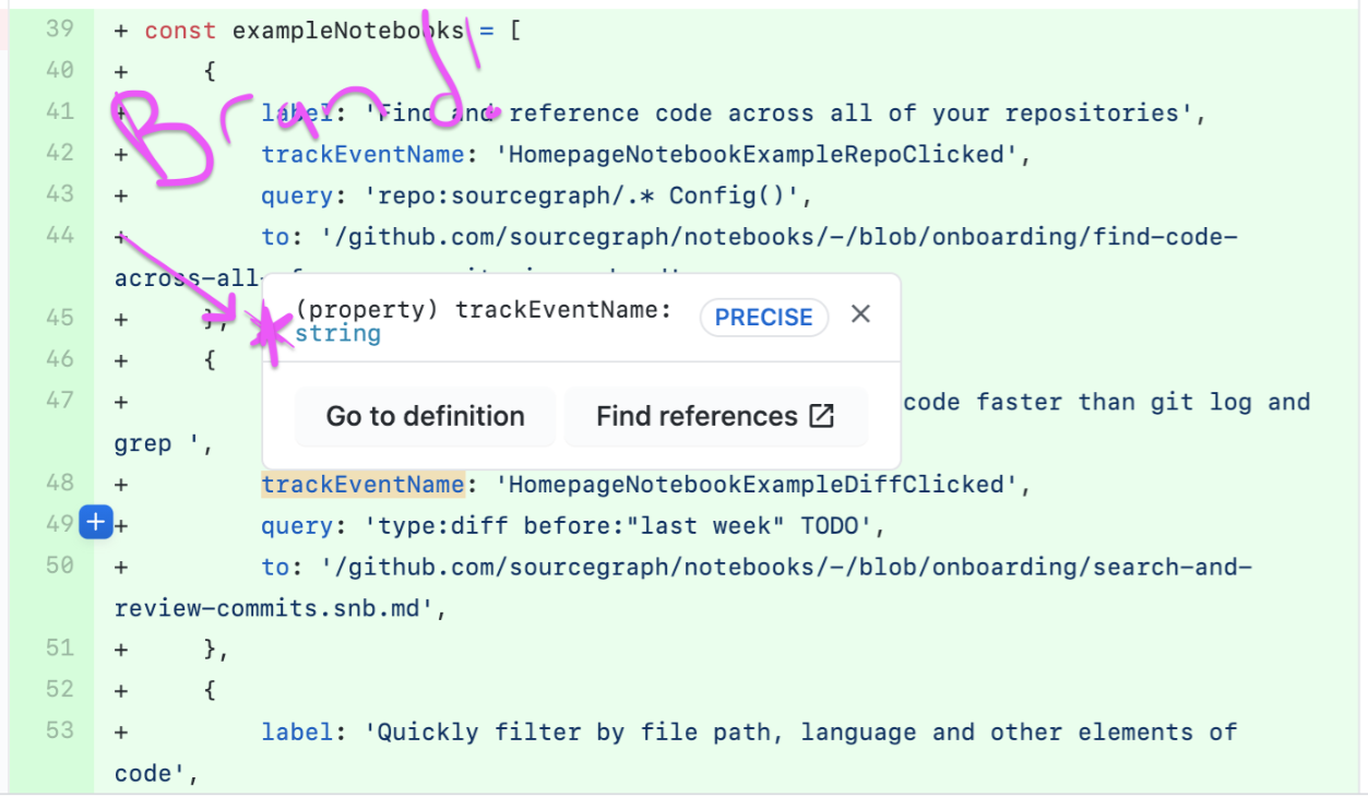
(Subtly) add Sourcegraph branding to the extension/native integration popovers
Created by: Joelkw
This is not a priority for the team, but if/when we have a quick design, it's worth implementing quickly. Feedback from @rrhyne:
When using the browser extension on GitHub in a PR review, it was not immediately apparent to me if this was part of our extension or GitHub. Suggestion: brand the popover.
Consideration from @sqs:
We haven't wanted to brand it because the branding can look like we're just trying to advertise it. I don't want it to be confusing, though. How can we make it clear where it came from without being seen as just promoting ourselves? We used to have that [wildcard logo next to title] and we removed it. I know I thought it felt too advertising-y personally, and we got some complaints about it. We have also gotten a lot of compliments about how it feels like it blends in. I can definitely see the need to clear this up, so take my feedback as input not a blocker.
From @tommypez :
How about a thin colored border on either the box or the buttons, or elsewhere to reference our brand subtly and differentiate from GH? I agree with Rob in that it needs to be clear you're using our extension though. Think of the Grammarly extension when you're using Google Docs – it doesn't need to be that "intense" but they do things to make it clear you're seeing a Grammarly suggestion vs the usual G docs suggestions for things like typos and word choice. I'd be curious as to whether the negative feedback on adding the Star logo is widespread or not too, because it can be added small enough as to not be a distraction as another option.
