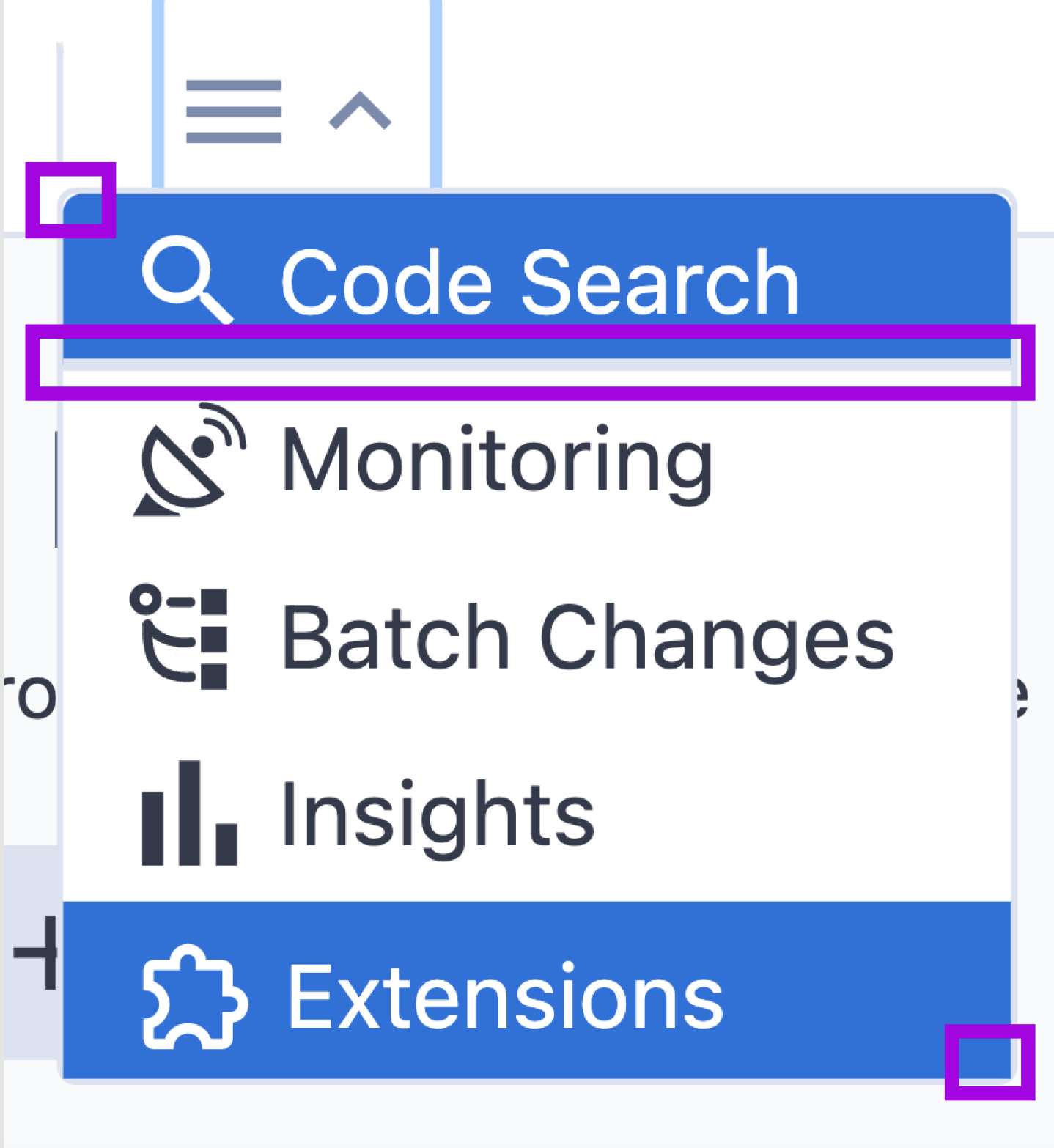
Refresh: corrections to nav menu visuals
Created by: AlicjaSuska
##Description
In the nav menu (part of the design refresh):
- on hover, the unnecessary underline appears
- on hover / active top and bottom elements have incorrect border-radius (top is 1 px too small, the bottom has 0 border-radius). Please, note that elements in the middle should have 0 border-radius (that's correct in the implementation)

Also, after clicking on the row, the navigation items 'jump' slightly because of this underline. I've recorded the video to show it.
##Urgency It's not a blocker for the refresh but should be fixed to make the nav menu look polished.