Improve usability of toggle + label elements
Created by: quinnkeast
Problem
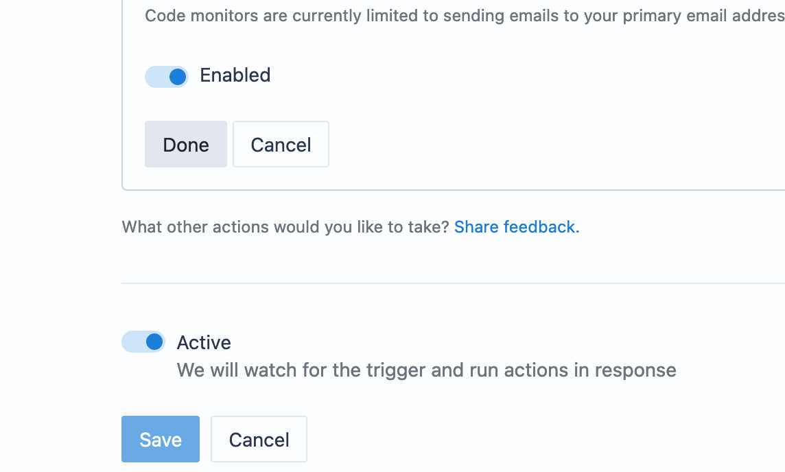
We use the toggle element in a few places in Sourcegraph, sometimes with and sometimes without a label.
With label:
Without label:
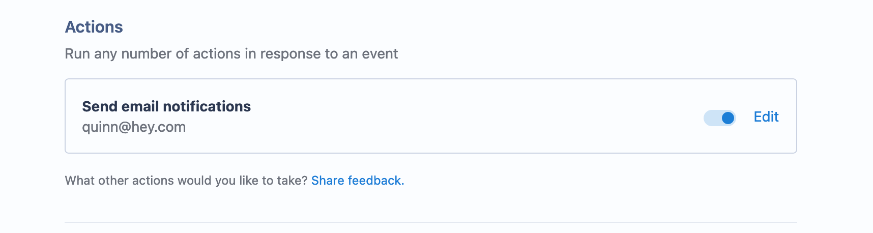
When we use the toggle with a label, only the toggle is interactive. Clicking the label doesn't cause the toggle to flip. This feels contrary to best practices for usability and accessibility, particularly in relation to checkbox and radio elements, in which the checkbox or radio should be contained within the label, and clicking the label toggles the element. This improves usability and accessibility by massively increasing the interactive area.
Proposal
We should expand the toggle component to include an optional label, and optional description/helper text, as part of the toggle. Then, that label can be part of the triggering element.
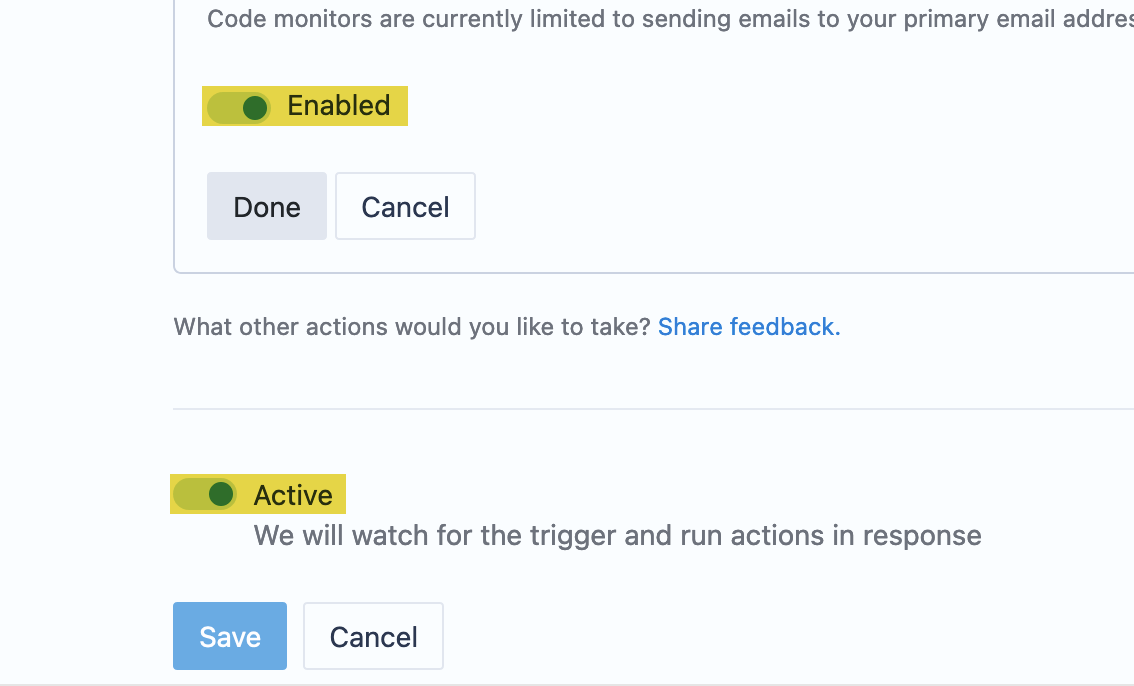
What's clickable today:
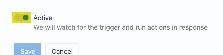
What should be clickable:
Additionally, we may want to change the label itself depending on the toggle state. In the above example, the label should change from:
Active Code monitor will watch for the trigger and run actions in response
to:
Inactive Code monitor is not watching for the trigger
Note from Alicja: Please, update the storybook within this issue.