Deleting and "nuking" users as a site admin has scary usability
Created by: quinnkeast
The problem
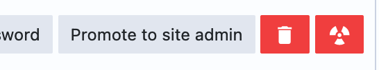
In the user management section of site admin (/site-admin-users), we have two actions available:
- Delete user (soft delete)
- Nuke user (hard delete)
These are presented with almost-equal button styling:
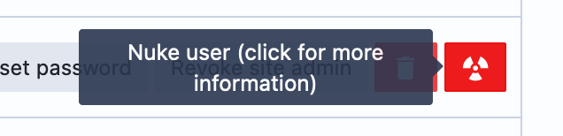
The tooltip for nuking a user is terrifying usability-wise:
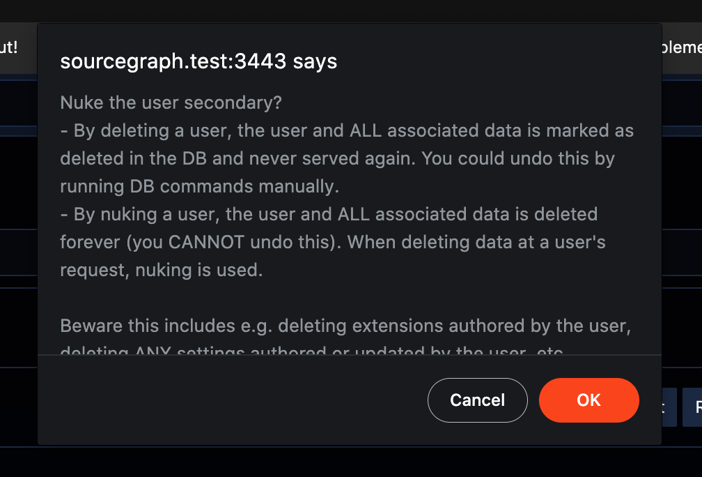
When the user clicks the either the "Delete user" or "Nuke user" button, they're presented with a browser alert to confirm:
We should improve this flow so it's less terrifying and more clear, and honestly, more sensitive.
Proposed changes
First, I strongly recommend changing the name of these actions for clarity and sensitivity.
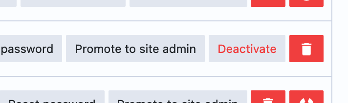
-
DeleteDeactivate -
NukeDelete
(Note: I understand that the implementation for soft delete almost certainly relies on a field like deleted_at or a deleted_users table, so renaming it to "Deactivate" can introduce incongruity, but this copy is user-facing while our database terminology is internal, so user-facing clarity wins out.)
Second, we should update the buttons to communicate these actions more clearly. Since the rows in the UI are already quite packed, there's two options here, one quick and one a bit more involved.
The quick approach: We replace the "Delete" button with a secondary button style with red text and a text label, and we replace the "nuke" icon with the trash can icon.
The more involved approach: We redesign the rows to better accommodate the content without using buttons for everything.
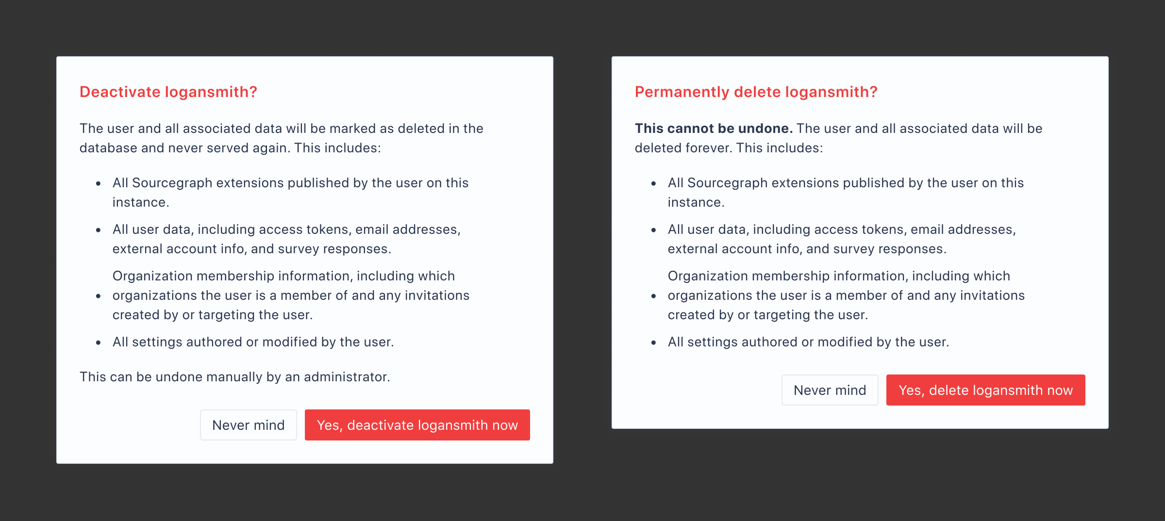
Third, we should replace the browser alert with our own modal with more purposeful copy that follows our actionable language guidelines, like so:
Finally, I'd also submit a PR to update language on the docs page for user data deletion to align all content.
Thanks @flying-robot for flagging this issue and talking through it!