Code Insights: Line chart has an odd hover areas distribution
Created by: vovakulikov
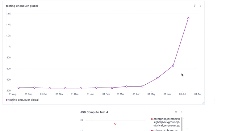
From @coury-clark
The distance that the cursor can move around data points on our charts is very oddly weighted to one side, and makes it feel very confusing when hovering over points