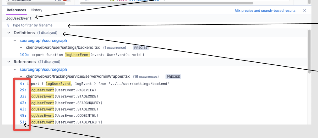
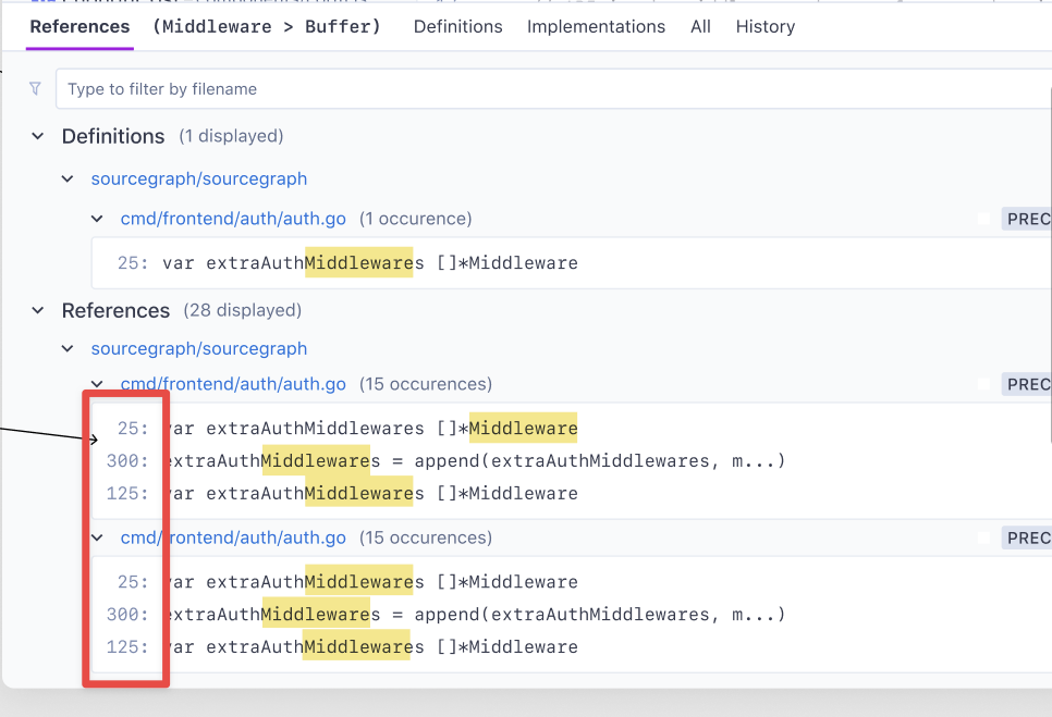
Make line numbers be the same color as line numbers in the search app.
Created by: Numbers88s
As part of the UI update of the reference panel we need to show that line numbers are not filters, or links. They should be the same color as line numbers in the search app.
Also line numbers should be right aligned, so that all code starts at the same distance from left edge Min width of 40px, or 5 characters. If they go beyond 5 chars, it’s ok if those items are longer.
Current Design:
Updated Design:

